The Quiet Joy of Choosing Your Own Font
Typography is a quiet force. Most of the time it goes unnoticed, yet it shapes how every word feels. We spend hours writing, editing, refining ideas—but often let the letters themselves speak in someone else’s voice. That small mismatch can matter more than we think.
The Moment You Stop Accepting Defaults
There’s something unexpectedly personal about choosing your own font. It’s not about design theory or perfect pairings—it’s about intention. The moment you pick a typeface on purpose, your writing gains its own temperature. It stands a little taller.
Tablog now lets you define your own font style, and while the feature is small, the gesture isn’t. It’s like opening a window in a room you didn’t realize was stuffy.
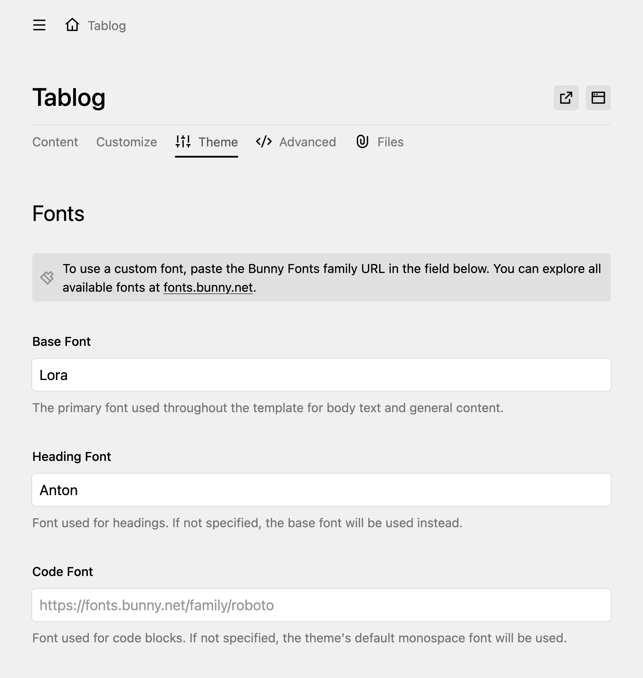
Even a tiny configuration feels like a quiet declaration. And somehow, the page feels more yours than before.
A Gentle Act of Authorship
The web automates everything these days, often too much. But typography remains personal—one of the last handcrafted decisions in digital publishing. Choosing your own font is a reminder that the blog belongs to you, not to presets or platforms.
If you want to see the tool behind it, the feature is powered by my own Font Picker for Kirby, designed to keep this choice simple and privacy-friendly. But the real story isn’t the plugin.
It’s the feeling of alignment when your words finally look the way they sound in your head.
A small act, yes.
But small acts of authorship are how identity takes shape.